Basic Rule of Composition
Basic Rule of Composition
The arrangement of visual elements in an image. To emphasize the subject, mood, and action of an image and make it both easily understood and aesthetically pleasing to the viewer.
The compositing and Editing include Color, Shape, Line, Contrast, Positioning, Viewpoint, Rhythm, Perspective, Proportion, and Geometry.
6 Basic Rule of Composition
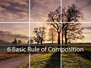
The Rule of ThirdsDivide your image into thirds and place your focal points near the intersections.
The Golden Means
Divide your image into eights and place your focal points near the intersection of 3/8 & 5/8.
Do not bisect your image horizontally or vertically. Do not place important objects too close to the edge.
Positioning
Besides the rule f thirds or the Golden Mean, there are some other guidelines for positioning the focal points in an image:
1. A central Composition can be compelling and attention-grabbing, Symmetry enhances the feeling of respect, authority, and dignity.
2. For a more dynamic image, make sure you vary the heights and sizes of your image elements.
3. Unless you want to show that those elements are the equal point of view.
4. The Heavier the visual “Weight” of an image element, the nearer it should be placed in the middle of your image. Think of how you balance unequal weights on a seesaw. Also known as the “Fulcrum-lever” principle.
5. To create depth and interest, overlap objects in the image.
6. Beware of Tangents which are areas where a line or object just touches another line or object.
Shapes and Lines
1. Horizontal Shapes are perceived as stable and calm.
2. Vertical Shapes imply energy and growth.
3. Diagonal Shapes are the Most Dynamic. They can imply movement or tension.
4. Think about the mood of the image and the shapes that fit that mood. If an image feels boring, it probably needs more diagonals. Curves are more dangerous.
5. Triangles are a solid compositional shape. Arranging the focal points of your image in a triangular pattern leads the eye around the page.
6. Circles also catch the viewer's attention. You can use this to your advantage by flagging your focal point with a circle.
Rhythm and Repetition
1. Repeating the same types of shapes or lines within your image creates a pleasant rhythmic flow which you can also strategically break, to create a focal point or show contrast.
Cropping
The way you crop the image helps give it context. Plus some types of images fit more naturally in a horizontal Space or vertical space. When you have a choice, use this to your advantage.
1. Landscapes often work well in a horizontal orientation. When the background overshadows a figure, the image becomes more focused on the power of the environment rather than the figure.
2. Portraits or full-body images often fit well in a vertical orientation. Cropping an image closer to a figure brings the focus to the figure's thoughts or actions. Never crop a figure at a joint such as the neck, knee, wrist, waist, elbow, etc.
3. A Vertical orientation helps to emphasize a height difference. Cropping off part of an action or object gives an illusion that it continues beyond the frame.
4. Cropping out unnecessary objects or backgrounds can help bring focus to your subject.
5. Leaving room in front of a perceived action helps to create a sense of movement and space.
Viewpoint
The Viewpoint you choose influences the viewer's understanding of your illustration and which figure they identify with.
1. Viewing a figure or object from a low angle makes it appear dominant or intimidating.
2. Unsurprisingly, viewing a figure or scene from a high angle has the opposite effect.
3. Viewing a separate scene from within an illustration can be a great way of showing a division or contrast. It is also a nice framing device.
4. The Viewer will tend to identify with whatever character is most visible. Generally, it is the character that is closer to the viewer but could also be the character (3D Animation Movie) with the most readable face.
Keep this in mind if you are trying to show a hero/villain showdown.
Kshitij Vivaan offers career courses in Animation, VFX, graphics, web designing & compositing editing plus for students from different cities of Gujarat such as Bhavnagar and Surendranagar. KSHITIJ VIVAN helps these students get the best job placements according to their skills and talents to get the best start in their Professional Careers


